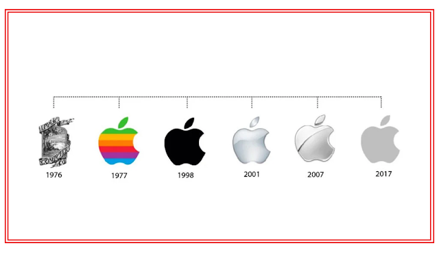
People consider the Apple logo, especially its bitten apple design, one of the most iconic logos in the history of technology and design. But what is the mystery behind this apple symbol?
The Apple logo was first created in 1976. At that time, the company’s co-founders, Steve Jobs and Ron Wayne, designed the first logo, which was quite complex. The logo depicted Isaac Newton sitting under an apple tree with an apple falling above his head, symbolizing science and innovation. However, because this logo was too complex and not simple enough, Steve Jobs felt the need for a new design.
In 1977, designer Rob Janoff created the current logo for Apple, which is a simple symbol of a bitten apple.

The Mystery Behind the Bite in the apple Logo:
There are several theories and ideas about the bitten part of the apple. Some of these are:
“Byte” and “Bite”:
In the digital world, “byte” is a unit of data measurement, while “bite” means “a nibble.” People believe that a connection exists between the two words since Apple is a computer and technology company. The designer Rob Janoff included the bitten part in the logo, which is related to the “byte” in computer technology.
Indicating the Shape:
They included the bite so that the apple is clearly recognizable. A fully round apple could easily confuse someone with a cherry or another fruit. The bite clearly establishes the apple’s identity.
Symbol of Knowledge and Discovery:
Many believe that the bitten apple connects to the biblical story of Adam and Eve, where the apple symbolizes knowledge. Therefore, the bitten apple might symbolize knowledge, which reflects Apple’s idea of empowering people through technology and knowledge.
Honoring Alan Turing:
Another theory is that the bitten apple was created to honor the famous mathematician and computer scientist Alan Turing. Turing, recognized as a pioneer of modern computer science, tragically took their own life by consuming an apple laced with cyanide.. Although Apple has never directly confirmed this theory, it remains a popular one.
Changes in the Logo’s Color:
Apple’s first logo was colorful with stripes, used during the release of their Apple II computer. This colorful logo reflected the innovative features and novelty of their products. However, in 1998, the Apple logo was changed to black and gray, reflecting the modern and minimalist design of their products.
Written by Md Abdullah
